Inkodye
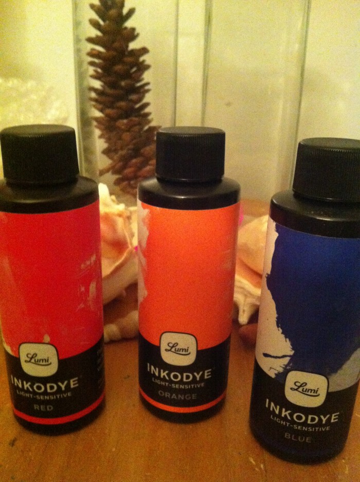
A year or two ago, I stumbled across a product called “Inkodye”. It’s a light-sensitive fabric dye system, which at the time was marketed in something like 12 or 14 different colors. I’ve been interested in trying it ever since, and finally got around to it; last week I ordered their current product line, which is just three colors (blue, red, and orange).
I grabbed an old rag from the closet and prepped it. The inkodye instructions suggest (but don’t say) that you should expose the dye while it’s wet, so that’s what I did, sacrificing the negative:

(… not to worry, I’ve got many more of those test charts where that one came from.)
I’ve also read that it exposes in sunlight similarly to cyanotypes. So, I dialed up 20 minutes on my exposure box (which is my standard cyanotype exposure time) and exposed the ex-t-shirt rag in my vacuum frame, stopping a few times to see how it looked. At 5 minutes:

At 10 minutes, it was slightly darker:

And the full 20 minutes, ever so slightly darker still:

After 20 minutes, I peeled off the now-soaked negative, exposing this:

Which, after washing in hot water for about 10 minutes, looks like this:

I don’t think it’s going to be an even enough exposure for me to get a good scan and negative curve, but it’s enough to tell me that I’m in the ballpark. It looks like an uncurved negative, for about 20-30 minutes exposure in my light box, is pretty good.
So, next, I tried out paper. This is a piece of Rives BFK, which I coated with the remainder of the dye, and then let it dry for about 15 minutes. Sadly, I couldn’t see what parts of the paper were sensitized any longer, which meant I missed a little when I placed the negative:

Again, a 20 minute exposure, followed by washing the paper for about 20 minutes in warm water (because that’s what I’d already drawn for the t-shirt, not because I thought it needed hot water):

… proving that it works once dried, too.
Over the weekend I hope to get scans of both of those and see if I can make ChartThrob curves for new negatives. The tonality of the t-shirt print looks pretty good; the tonality of the paper print looks similar to gum, requiring a fairly high-contrast negative.
So, some quick takeaways:
This is really easy to use. It’s also really easy to not use enough of the dye. It doesn’t brush on well with lightweight foam brushes; it would probably do better with a high density roller.
It exposes like cyanotype, as promised.
The prints on cotton with wet dye look like they have a good tonality. Prints on paper with dried dye have a much more limited range (this may be because of the drying, or it may be because of the substrate).
The dye works even when dry. It’s also near-impossible to tell where the dye is when it’s dry, so marking the work area beforehand is a must.
Printing a multi-layer three-color image is going to be a challenge on fabric. You have to wash the fabric between layers and subsequent registration is going to be much harder than paper, since there’s less rigidity.
Great reading about your experiments! Have you seen these two examples of 3-color process with Inkodye Red, Blue and Orange?
http://pinterest.com/pin/59813501271415166/
http://www.kickstarter.com/projects/lumi/print-on-fabric-using-sunlight-the-lumi-process/posts/266315
No, I hadn’t – thanks!