Uncategorized
Floating Pins

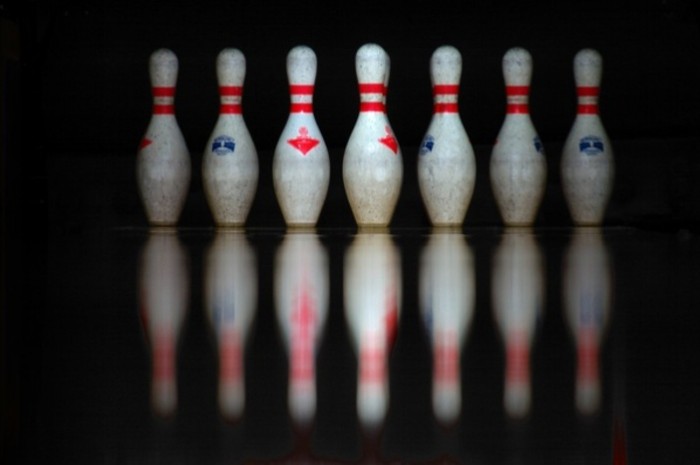
Thanks to Strikes in West Philly, who graciously let me snap photos today (going as far as bringing me my own pin to shoot). I’m particularly happy with this one, which looks (to me) like the pins are floating in mid-air.
It looks like an advertisement to me. I wonder why my brain made this connection!
Any clue? What makes a good advertisement picture? What makes it look like one?
Anybody who would like to share a thought on that?
Wow, two “looks like an ad” posts in two days. I must be improving. 🙂
Some charactersistics of ad pictures: high saturation, strong focus on a product, lots of polish. I’m not sure what made you think of an ad for this one, although it does have strong focus (just the pins, really). My previous post had strong focus on the sticker, high saturation, and was very clean (contents of the picture, that is — not just the words on the sticker!).
Other thoughts?
… and I considered polishing this picture to ad-quality: removing all of the dirt on the pins, adjusting the brightness of the outer pins using multiple layers from different exposures (yes, I took this shot more than once). Ultimately I decided that was too much work and I liked it this way. I like that the pins are used. I like that they’re facing different directions. I like that the pins in the back are darker than the pins in the front, giving a sense of depth.
Re: bringing to ad quality
Reality rocks!
–SJ
Very interesting. It reassures me, that someone else thought about the previous picture as an ad picture too. After my comment on this one, I went to the previous foto and thought the same and feared to start making things up.
I think a good reason why it looks like an ad to me is that there is a strong contrast between the bg and the center pin that gradually lessens towards the sides of the pic. So the viewers attention is immediately drawn to the center pin.