Uncategorized
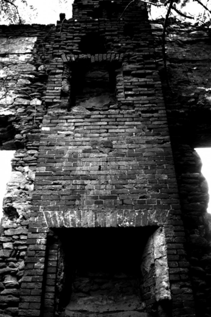
Ruined Cross

This is my alternate processing for yesterday’s shot. I’m looking for feedback on which one people think is better. Yesterday I liked the sepia image better, and today I prefer the B&W. What do you think?
Hi, I prefer this B&W version of the shot. The sepia tone works nicely, however I think that the B&W gives it the atmosphere that this shot requires and deserves.
I’m trying to do more post processing on my shots, and its good to get ideas and comparisons from others. Cheers
Hmmm – that’s a tough one. Both versions work really well, but I’m leaning toward the sepia tone only because you can see more detail in the shadows.
I’m with Steve — contrast is too high for my tastes on this one, and the blooming around the right window is more distracting on this one. However, I think I like the greyscale better than sepia; bricks and sepia don’t seem to mix.
Thanks for the feedback. I like the sepia better because it goes with the bloom which “anonymous” pointed out, and because it seems to have more detail in the shadows. But I like the atmosphere of the B&W version.
Interestingly, the sepia version came directly from the B&W version. I’m not quite sure how that translates into more detail in the shadows; it has to be an artifact of some blurring done during the process. It’s certainly undeniable.
Oops, sorry, “anonymous” was me.