Uncategorized
Treetops

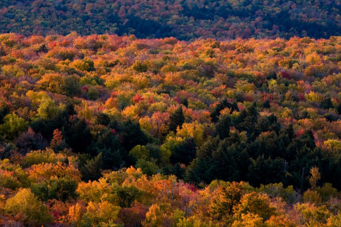
Continued shots from the Catskills. I was undecided on this one whether I wanted to leave the mountain behind these trees at the top of the shot or not. Perhaps I’ll try it the other way tomorrow and post the results… [update] decided to do it now. comemnts on the pair welcome! Which do you prefer?
I prefer the bottom one, and I agree with the rotation as well. It’s more abstract, about the colors and patterns. The additional context of the top one makes it about the landscape, which is otherwise uninteresting.
I pretty much agree with Mark – the narrow slice of landscape on the original is too small to do it justice. The “detail” shot works better.
The colors are amazing – and I don’t see any mention of saturation-goosing in your processing notes!
Thanks, me too. Which is why I decided I couldn’t wait. 🙂
I cherry-picked this particular shot because of the colors. In the uncropped shot you can see how quickly the color washes out in the haze; I’m sure the next mountain over was just as vibrant.
I like bottom one better, too. I am loving this series!